The Blitz’ Introductory Tutorial
The most useful part of Blitz is probably the LESS design system and our goal today is to see how it indeed can be.
Now, you might not be familiar with LESS….
So think of it as a design system you can use to create your stylesheets. You build with bricks, it’s like Lego. And it should be fun.
In this tutorial, we’ll see how to typeset the most common parts of a no-frills novel.
How to edit and compile those files
LESS can be seen as CSS on steroids: it’s a bunch of text files you can open in your favorite editor (TextWrangler, Atom, Sublime Text, Notepad, etc.).
The Tricky part is actually compiling LESS to CSS since Reading Systems obviously don’t support LESS. You’ve got two options:
- install node.js, install the LESS package and run a command prompt (see Installation);
- use dedicated apps like Crunch or SimpLESS, or install plugins for you favorite text editor.
Customizing blitz.less
By default, Blitz outputs quite a lot of styles, which creates a stylesheet with 1100+ lines of CSS. Truth is you probably don’t need a lot of the styles in there so we’ll customize blitz.less a little bit.
/* Begin CSS */

// Reference > won’t be output
@import (reference) 'reference/font-stacks';
@import (reference) 'reference/hyphens';
@import (reference) 'reference/overrides';
@import (reference) 'reference/mixins';
@import (reference) 'reference/enhancements';
@import (reference) 'reference/i18n';

// We import utils as reference since we
// don’t want to output their contents in CSS
@import (reference) 'utils/containers';
@import (reference) 'utils/utilities';
@import (reference) 'utils/break';

// That's the stuff running Blitz, its engine
@import 'core/variables';
@import 'core/rhythm';
@import 'core/features';
@import 'core/kindle-queries';

// Base is the foundation = styles you'll use in every book
@import 'base/reset';
@import 'base/page';
@import 'base/typo';
@import 'base/image';

// We get rid of a lot of optional extensions since we
// don’t need them. We only keep rules because
// we wan’t to use the asterism.

@import 'extensions/rules';

/* End CSS */
If you take a look at the default file, you can see we got rid of the extensions we don’t need (tables, code, lists, etc.) and moved utilities to reference.
When importing a file as a reference, its contents won’t actually be output in your stylesheet but will be available in LESS.
Set your variables
Variables are like settings, they are used all across the framework. So, basically, if you customize those values, everything will be dynamically restyled based on your settings.
Those settings are to be found in the core folder.
// ------------- //
// Configuration //
// ------------- //

// Typo
@body-font-size : 16;           // PX | default = 16 //
@body-line-height : 1.5;        // Ratio //

// Rhythm
@major-third: 1.25;
@minor-third: 1.2;
@major-second: 1.125;
@minor-second: 1.067;
@unison: 1;
@scale-factor : @major-second;

// Horizontal grid
@step : 3.75%;                 // customized

// Colors
@primary-color : inherit;
@secondary-color : crimson;    // customized

// Variables below (decorations and lists) we
// don’t need to customize as they won’t be used
As regards the step variable, percentage won’t reflow with font size but you’re free to use the unit you want. Bear in mind em will reflow and px can be tricky.
Reset (base)
No need to customize this, except if you want to remove selectors you know won’t be used in your eBook.
To sum things up, the reset serves as a sanitizer: it forces CSS defaults for all HTML elements and we’ll build our custom stylesheet on top of it—BTW, if you just want to use our reset, we’ve got you covered.
By using this approach, we’re also trying to encourage you to not repeat yourself since you only need to change some values and add extra declarations.
Here are the defaults.
block-elements {
  margin: 0;
  padding: 0;
  font-size: 1em;
  line-height: inherit;
  text-indent: 0;
  font-style: normal;
  font-weight: normal;
}

html5-block-elements {
  display: block;
}

headings {
  text-align: left;
}

epub3-toc-list {
  list-style: none !important;
}

epub3-landmarks-and-page-lists {
  display: none;
}

inline-elements {
  font-size: inherit;
  vertical-align: baseline;
  font-style: inherit;
  font-weight: inherit;
  color: inherit;
  text-decoration: none;
}
As you can see, it’s now just about changing and adding some declarations for some specific elements.
For instance, chances are you’ll just need to change text-indent or margins for paragraphs.
Page (base)
Think of those declarations as your global page layout.
Again, no need to customize this. But since we are rebels, we’ll do it anyway.
@page {
  margin: 24px 3.75%; /* more consistent with our settings */
  padding: 0;
}

body {
  font-size: ((@body-font-size / 16) * 100) + 0%;
  line-height: @body-line-height;
  margin: 0;
  padding: 0;
  widows: 2;
  orphans: 2;
}
We’ve changed the margins for the @page selector, which is used in legacy RMSDK for example.
Those margins are now more consistent with the custom settings so vertical margins are equal to the line-height and horizontal margins are equal to our customized step.
As you can see, we’re making use of the font-size and line-height variables for body. The idea is setting those two properties in body so that it applies to the whole document. Therefore, all elements in body will inherit.
Typography (base)
This is the file we’ll customize to typeset our novel.
By default, we’ve typeset a lot of common elements but you could start from scratch. This is the file where “Blitz as an API” makes sense as we’ll use mixins (building blocks) to build a stylesheet.
Let’s start from scratch.
Hyphens
First, we’ll disable hyphens for selected elements.
h1,
.copyrights {
  .disable-hyphens;
}
It takes one mixin to output the following CSS:
h1,
.copyrights {
  adobe-hyphenate: none;
  -ms-hyphens: none;
  -moz-hyphens: none;
  -webkit-hyphens: none;
  -epub-hyphens: none;
  hyphens: none;
}
Here .disable-hyphens might well be a lot more understandable than adobe-hyphenate, a proprietary property for the legacy RMSDK, which you might not know since it’s undocumented.
Typographic scale
h1 {
  .rhythm(3, 2, 2);
}

/* p */
.copyrights {
  .fs-s;
}
We’re using different mixins there. Let’s clarify this a little bit.
.rhythm(3, 2, 2);
.rhythm(scale-step, number of lines for margin-top, number of lines for margin-bottom)
For h1, we declare the font-size should be 3 steps above in the typographic scale, margin-top and -bottom should be 2 lines each.
Now, this is a parametric mixin: everything will be computed based on the font-size of the element, including line-height.
Rhythm is part of the Blitz engine, you can use it to enforce vertical rhythm. If you don’t want to output margins, there’s a another mixin you can use:
.fs-[xs|s|m|l|xl|xxl|jumbo]
The fs mixin only computes font-size and line-height.
/* p */
.copyrights {
  .fs-s;
}
Here, we’re creating a class for copyright paragraphs. The mixin lives in the utilities file and it tells to output a font-size one step below in the typographic scale (and will compute the line-height to keep vertical rhythm).
Of course, using those mixins is up to you. You could add your own variables in the settings and use them in lieu of our rhythm mixins—that’s the power of fork.
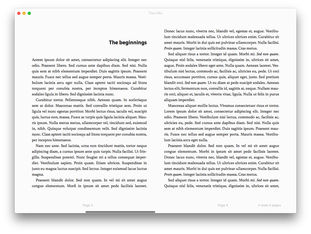
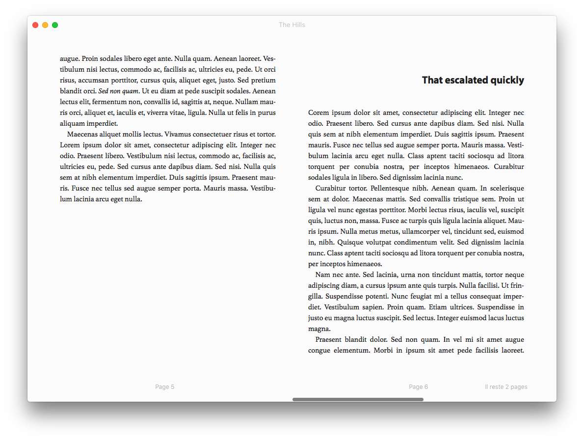
Typesetting
That’s a good start but there’s a lot more to style.
Let’s say we want something with a modern twist.
h1 {
  .rhythm(3, 2, 2);
  .align-right;
  .humanist;
  .bold;
}

p {
  .indent;
}

/* p */
.first-para {
  .no-indent;
}

/* p */
.copyrights {
  .fs-s;
  .no-indent;
  .align-left;
  .humanist;
}
To sum things up:
- we’ve aligned
h1on the right—which removes the indent, same for.align-center—, picked a humanist sans-serif typeface and applied bold; - we’ve indented paragraphs (using our step setting in variables);
- we’ve created another class for the first paragraph in each chapter and removed the indent;
- we’ve removed the indent for copyright paragraphs, aligned them left and picked a humanist typeface.
And it took zero line of CSS to achieve that. We’ve basically described how we wanted those elements using Blitz’ mixins.
And we’re finished styling our block elements.
Microtypography
Let’s take care of inline elements now. We need italics, superscripts and links.
Let’s start with italics.
i, cite, em {
  .italic;
}

/* Get back to normal when italic nested in italic */
i i, i cite, i em,
cite i, cite cite, cite em,
em i, em cite, em em {
  .override-italic;
}
Those are defaults in typo.less, but we removed dfn as we don’t need it. As you can see, we even took care of italics nested in italics (.override-italic = font-style: normal).
Let’s move to superscripts, whose default styling is notorious for breaking line-height…
sup {
  font-size: 75%;
  line-height: 1.2;
  vertical-align: super; /* Fallback */
  vertical-align: 33%;
}
Pure CSS there. It shows you don’t need to use mixins for styling elements if you don’t feel comfortable using them.
And finally, links.
a {
  .bold;
  .small-caps;
  text-decoration: underline;
  color: @secondary-color;
}
To sum up:
- we’ve made links bold;
- we’ve made them small-caps for Reading Systems which support the
font-variantproperty; - we’ve underlined them (reset removed that);
- we’ve applied the crimson color using the secondary-color variable we set at the beginning.
Recap
Our typo.less file should look like this.
h1,
.copyrights {
  .disable-hyphens;
}

h1 {
  .rhythm(3, 2, 2);
  .align-right;
  .humanist;
  .bold;
}

p {
  .indent;
}

/* p */
.first-para {
  .no-indent;
}

/* p */
.copyrights {
  .fs-s;
  .no-indent;
  .align-left;
  .humanist;
}

i, cite, em {
  .italic;
}

/* Get back to normal when italic nested in italic */
i i, i cite, i em,
cite i, cite cite, cite em,
em i, em cite, em em {
  .override-italic;
}

sup {
  font-size: 75%;
  line-height: 1.2;
  vertical-align: super; /* Fallback */
  vertical-align: 33%;
}

a {
  .bold;
  .small-caps;
  text-decoration: underline;
  color: @secondary-color;
}
Once you’re getting used to Blitz’ mixins, things are likely to go more smoothly and you’ll then discover or design more powerful mixins to achieve complex stuff.
Yes, it does feel like we’re sometimes “mixinifying” the CSS spec but, the idea of the Blitz’ meta-language is to abstract CSS declarations you’ll use over and over again, bringing consistency to your stylesheets.
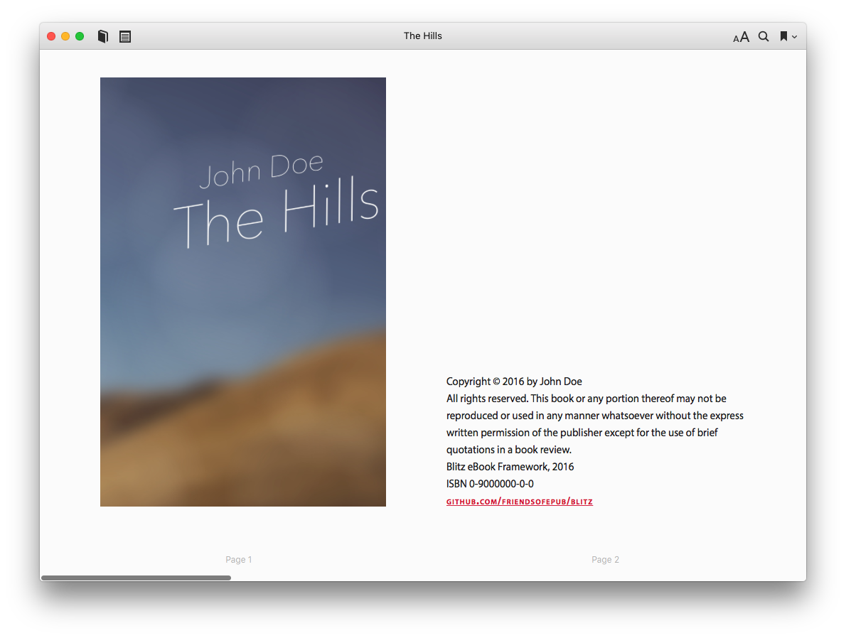
Images (base)
Let’s imagine we need styles for a cover. We have to customize image.less a little bit.
.cover {
  .h-100;
  .align-center;
}

img {
  width: auto;
  max-width: 100%;
  height: 100%;
  max-height: 95%;
  object-fit: contain;
}

@supports (height: 99vh) {
  img {
    height: 99vh;
  }
}
We’ve removed a lot of stuff in this file but don’t worry, we just got rid off what we didn’t need.
To sum up:
- we’ve created a wrap,
.cover, and declared anheightusing the mixin.h-100(to be found in containers); - we’ve centered the image inside this wrap (
.align-center); - we’ve declared dimensions for the image;
- we’ve added
object-fit: containto make sure the image keeps its aspect ratio on Reading Systems which support it; - we’ve made a feature query (
@supports) to declare anheightinvh(viewport height) for Reading Systems which support this unit. This declaration will override both the image’s (in%) and the wrap’s.
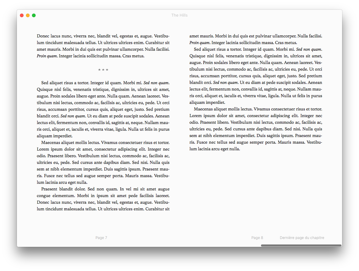
Rules (extensions)
We’re almost there. We now need to take care of the rules extension since we’ll use it for context changes (blank-line + asterism).
/* Blank-line context change */
hr.transition {
  width: 100%;
  @computed-margin: (((@body-font-size * @body-line-height) - (@border-width * 2)) / @body-font-size);
  margin: ((@computed-margin / 2) + 0em) 0;
  height: (((@border-width * 2) / @body-font-size) + 0em);
  border: none;
  background: none;
}

/* Asterism */
hr.asterism {
  width: auto;
  border: none;
  margin: @base-margin 0;
  height: @base-margin;
  text-indent: 0;
  text-align: center;
  background: transparent url("asterism.svg") no-repeat center;
  background-size: 2.5em 1.25em;
  overflow: hidden;
  opacity: 0.7;
}
As you can see, we’ve removed the default styles for hr. We don’t need them since we won’t use an old-school rule in our eBook.
Now, it looks like those two are very complex but they aren’t in practice since you don’t need to modify those styles at all.
All the obscure parts, those with the variables, are allowing us to keep vertical rhythm.
Now, hr.transition is meant as a replacement for
<p> </p>
But it’s a lot more semantic, especially in EPUB3.
As for the asterism, you might want to change the url in
background: transparent url("asterism.svg") no-repeat center;
since we’re relying on an external SVG file. So you’ll probably put this file in a folder and have something like this instead…
background: transparent url("../Images/asterism.svg") no-repeat center;
This asterism will reflow with text—if the reading system supports the background properties—and is night-mode compatible. Believe it or not but it took an insane amount of work to achieve that—for semantics’ sake.
And we’re done. We can now compile to CSS.
The result
Here is the compiled CSS with the reset edited to cover our frugal needs.
@charset "UTF-8";

@namespace h "http://www.w3.org/1999/xhtml/";
@namespace epub "http://www.idpf.org/2007/ops";

address, div, figure, footer, h1, header, hr, nav, ol, p, section {
  margin: 0;
  padding: 0;
  font-size: 1em;
  line-height: inherit;
  text-indent: 0;
  font-style: normal;
  font-weight: normal;
}

figure, footer, header, nav, section {
  display: block;
}

nav[epub|type~="toc"] ol {
  list-style: none !important;
}

nav[epub|type~="landmarks"],
nav[epub|type~="page-list"] {
  display: none;
}

a, cite, em, i, small, span, sup {
  font-size: inherit;
  vertical-align: baseline;
  font-style: normal;
  font-weight: normal;
  color: inherit;
  text-decoration: none;
}

body > :last-child,
body > section > :last-child {
  margin-bottom: 0;
}

@page {
  margin: 24px 3.75%;
  padding: 0;
}

body {
  font-size: 100%;
  line-height: 1.5;
  margin: 0;
  padding: 0;
  widows: 2;
  orphans: 2;
}

h1, .copyrights {
  adobe-hyphenate: none;
  -ms-hyphens: none;
  -moz-hyphens: none;
  -webkit-hyphens: none;
  -epub-hyphens: none;
  hyphens: none;
}

h1 {
  font-size: 1.4375em;
  line-height: 1.04347826;
  margin-top: 2.08695652em;
  margin-bottom: 2.08695652em;
  text-align: right;
  font-family: "Myriad Pro", Seravek, "Trebuchet MS", "BN Trebuchet MS", "PT Sans", "Frutiger Neue", Roboto, sans-serif;
  font-weight: bold;
}

p {
  text-indent: 1em;
}

.first-para {
  text-indent: 0;
}

.copyrights {
  font-size: .9375em;
  line-height: 1.6;
  text-indent: 0;
  text-align: left;
  font-family: "Myriad Pro", Seravek, "Trebuchet MS", "BN Trebuchet MS", "PT Sans", "Frutiger Neue", Roboto, sans-serif;
}

i, cite, em {
  font-style: italic;
}

i i, i cite, i em,
cite i, cite cite, cite em,
em i, em cite, em em {
  font-style: normal;
}

sup {
  font-size: 75%;
  line-height: 1.2;
  vertical-align: super;
  vertical-align: 33%;
}

a {
  font-weight: bold;
  text-transform: lowercase;
  font-variant: small-caps;
  letter-spacing: .0625em;
  text-decoration: underline;
  color: crimson;
}

.cover {
  height: 99%;
  text-indent: 0;
  text-align: center;
}

img {
  width: auto;
  max-width: 100%;
  height: 100%;
  max-height: 95%;
  object-fit: contain;
}

@supports (height: 99vh) {
  img {
    height: 99vh;
  }
}

hr.transition {
  width: 100%;
  margin: .6875em 0;
  height: .125em;
  border: none;
  background: none;
}

hr.asterism {
  width: auto;
  border: none;
  margin: 1.5em 0;
  height: 1.5em;
  text-indent: 0;
  text-align: center;
  background: transparent url("../Images/asterism.svg") no-repeat center;
  background-size: 2.5em 1.25em;
  overflow: hidden;
  opacity: .7;
}
We didn’t create styles for the copyright page or the title page but it takes 157 lines of CSS to typeset the main part of your simple eBook.
Should you add those two, it would just take a few extra lines.
The reset is doing the heavy lifting and then it’s about changing and adding some styles on top of it.
And here is the resulting rendering (minus copyrights’ vertical align).
Sure, maybe you could have achieved that in fewer lines but what’s important is that the more your stylesheet grows, the more Blitz helps you save useless declarations hence optimize your CSS. In other words, Blitz was designed to scale well, in tune with inheritance and the cascade.
Conclusion
We get it. You may feel like meeting a monster at first encounter: there’s so much in there, the default stylesheet is more than 1000 lines of CSS, utilities and reset are quite huge by your standards…
So we hope this tutorial has convinced you using Blitz’ meta-language is not an impossible task. We’ve designed the LESS part with customization, practicality and linguistics in mind. Think of it as a language for typesetting eBooks: describe what you want to do and Blitz will (try to) obey.
As a matter of fact, if you get the fundamentals of LESS, there is no reason why you can’t use it.
Of course you must get used to variables, mixins, arguments and import options first. But that’s not more difficult than the cascade in CSS, the em unit or the CSS tricks you’ve created to get around Reading Systems’ overrides.
So please feel free to experiment with Blitz, report issues and request features you think would be useful. It took quite a lot of effort to design this framework but our primary objective was to create a solid bedrock upon which we could build powerful features.
And oh, by the way, if you’re not interested in using LESS, there’s a lite version of Blitz available; it’s 378-line long and weighs a tiny little more than 4kb.